A Considered Approach to Colour
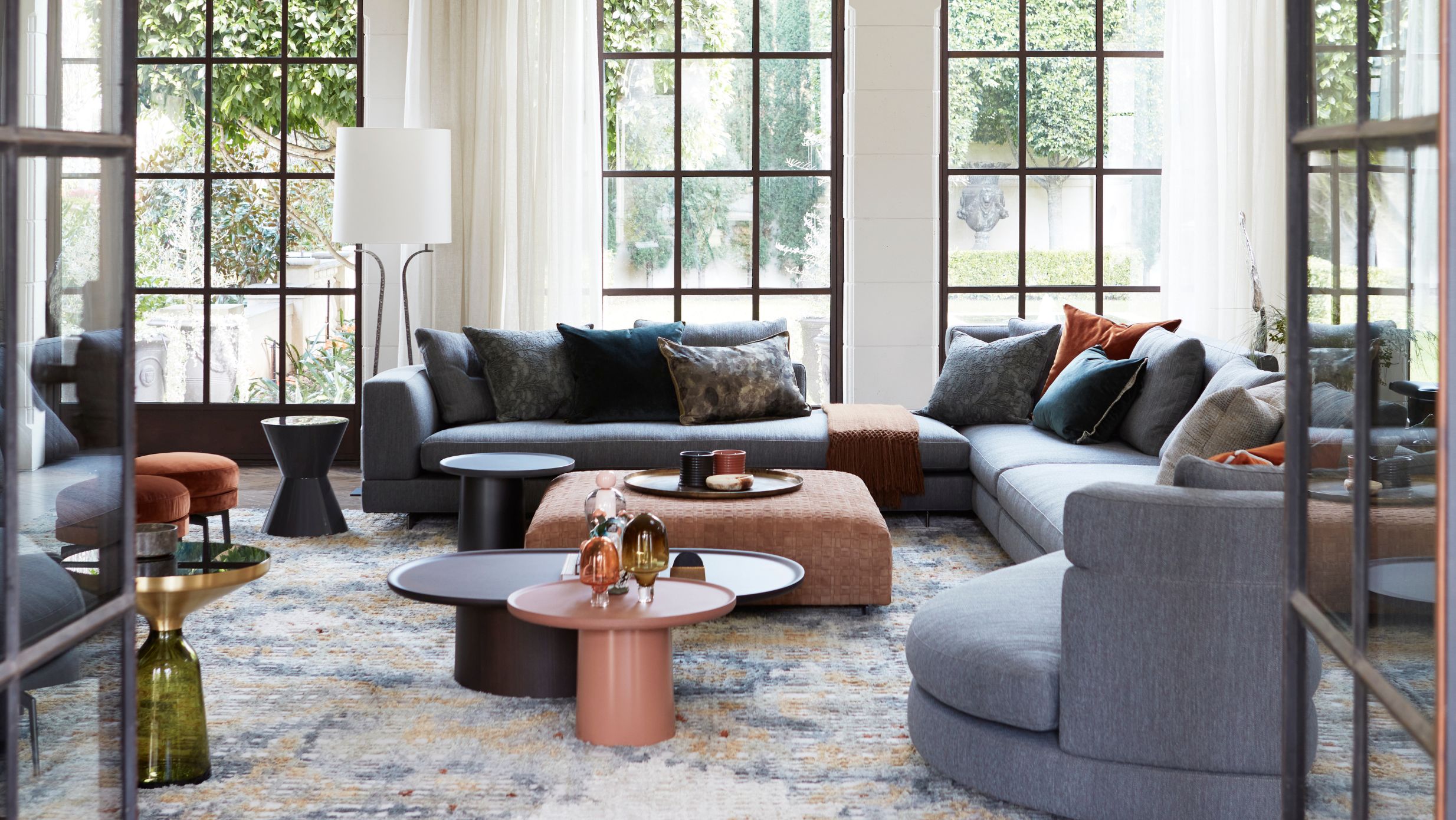
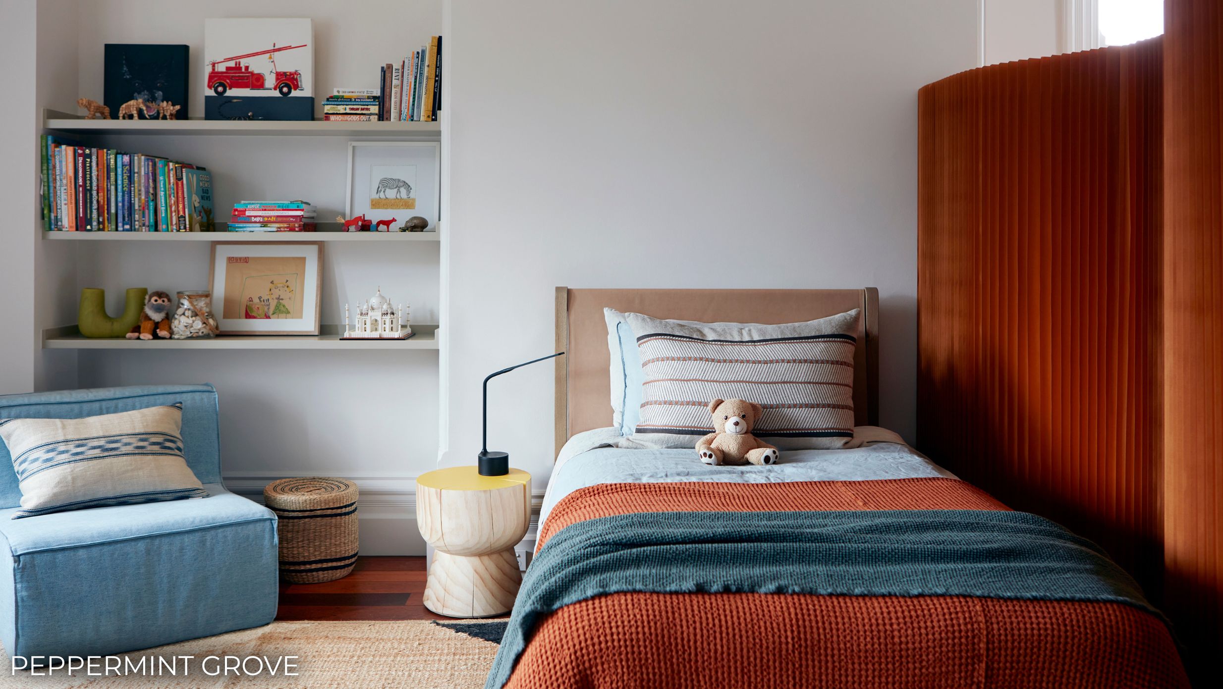
Ask someone what they love about a room and they’ll rarely name a colour. They’ll talk about how it feels, even if colour is quietly behind that feeling. The depth of a wool rug under your feet or the way a cushion holds a tone from the painting above it. Nothing announces itself. The room simply feels resolved, as if it was always meant to be this way.
That feeling takes time to arrive at. We see colour as one of the most lasting decisions in a home, so we treat it that way. It comes together slowly, layer by layer, over the course of a project. When we bring colour in, we tend to reach for deeper tones that ground a room and give it warmth. We want a home to feel as right ten years on as it did the day it was finished.
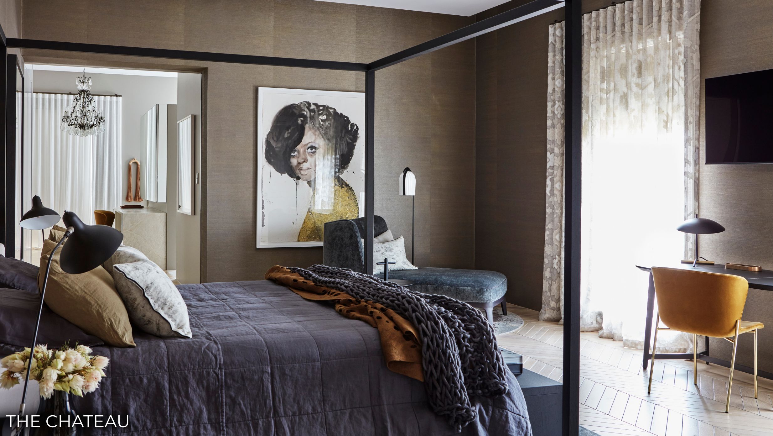
“We create individual palettes of colour and layers of texture to build balanced, harmonious living spaces. It’s not how much colour we use or how strong or bright the tone is – it’s the blending and complexity that creates the effect.”
– Meryl Hare
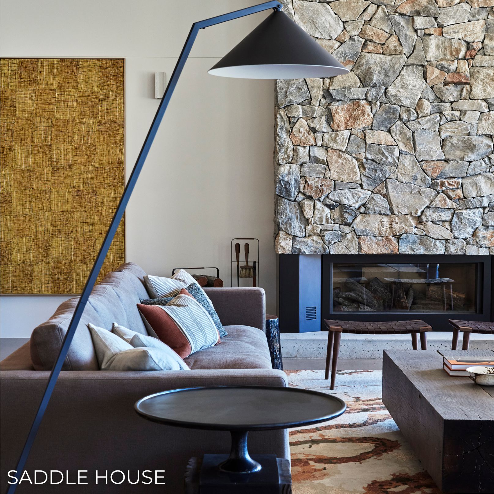
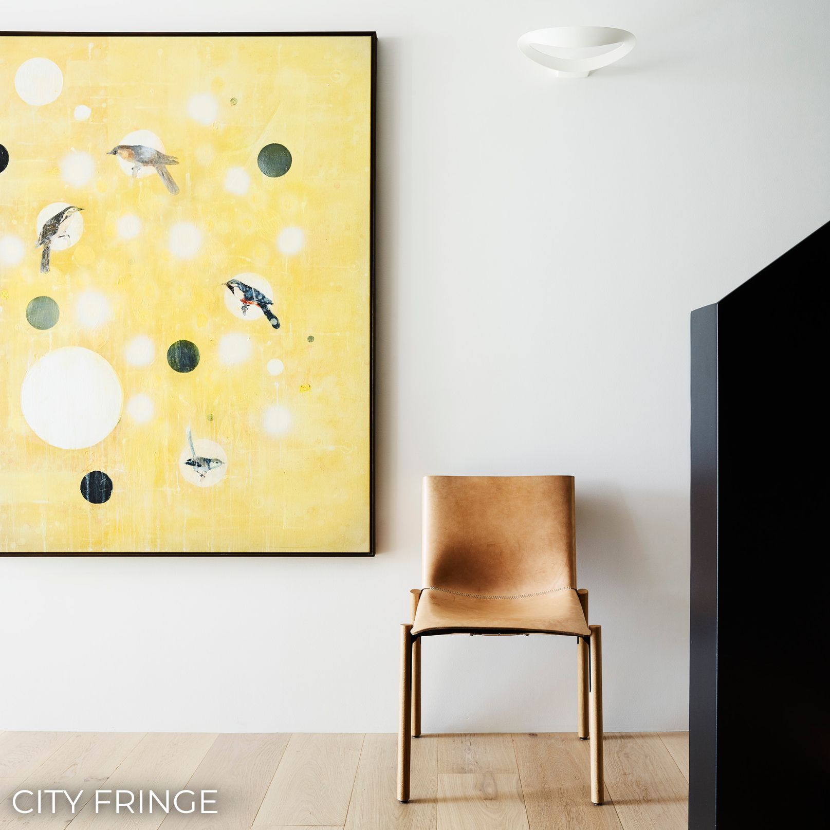
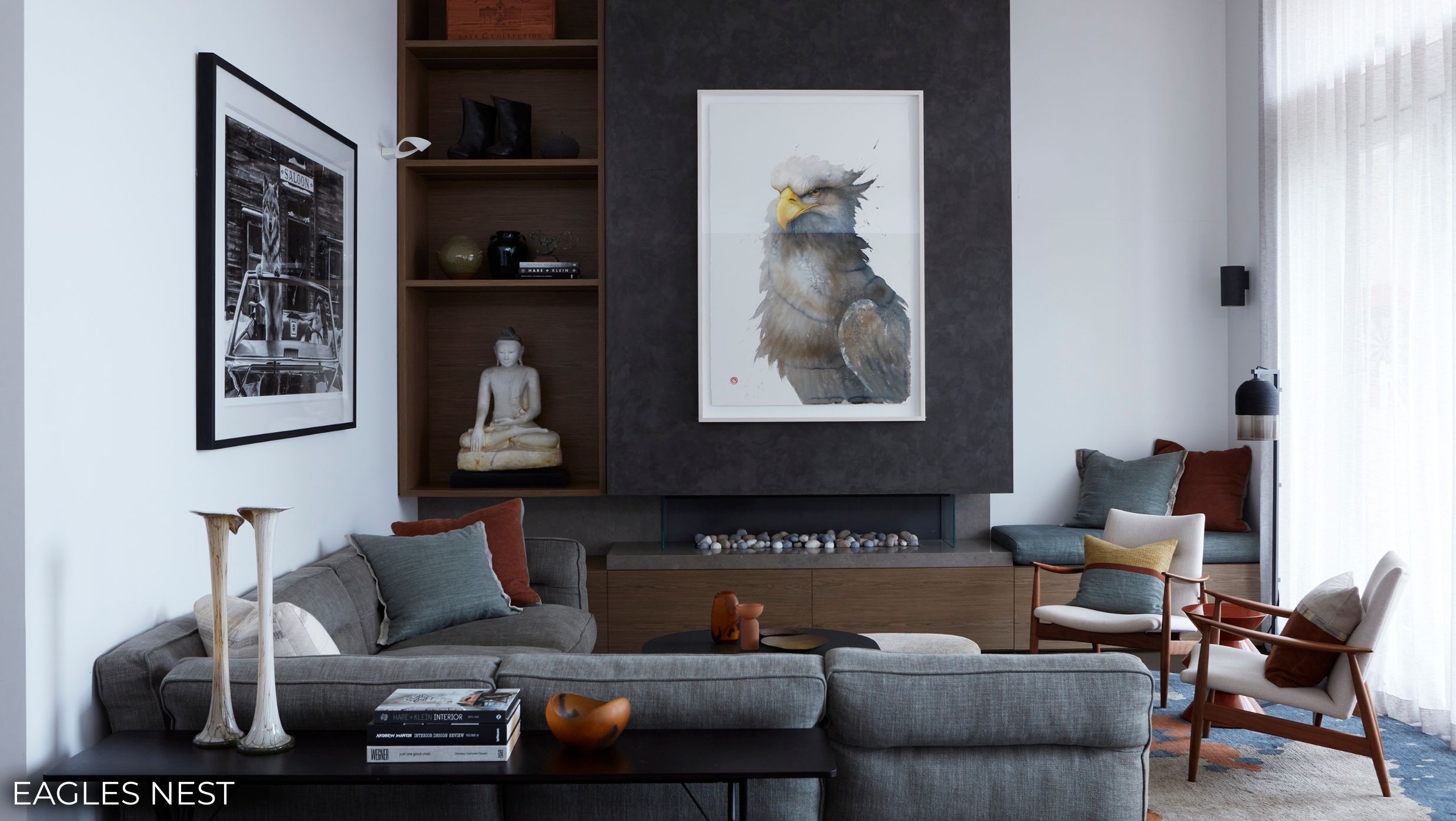
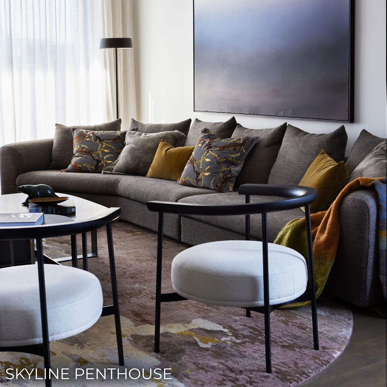
A palette begins with place. A house by the water, a home in the city and a property in the country each suggest something different. On the coast this might mean softer, weathered tones. In the city, something richer and more enclosing can feel right, while in the country the colours often come from the earth and stone around the house. The setting offers a starting point long before a sample is chosen.
Then there are the people who will live there. Every project begins with listening. Before a palette takes shape, we want to understand how a client lives and what they are drawn to. Someone who craves calm and simplicity will arrive somewhere very different from someone who has always loved bright colours or someone with a passion for Art Deco. Each of those homes can be equally right. Our role is not to impose a palette, but to understand a person’s taste and give it form.
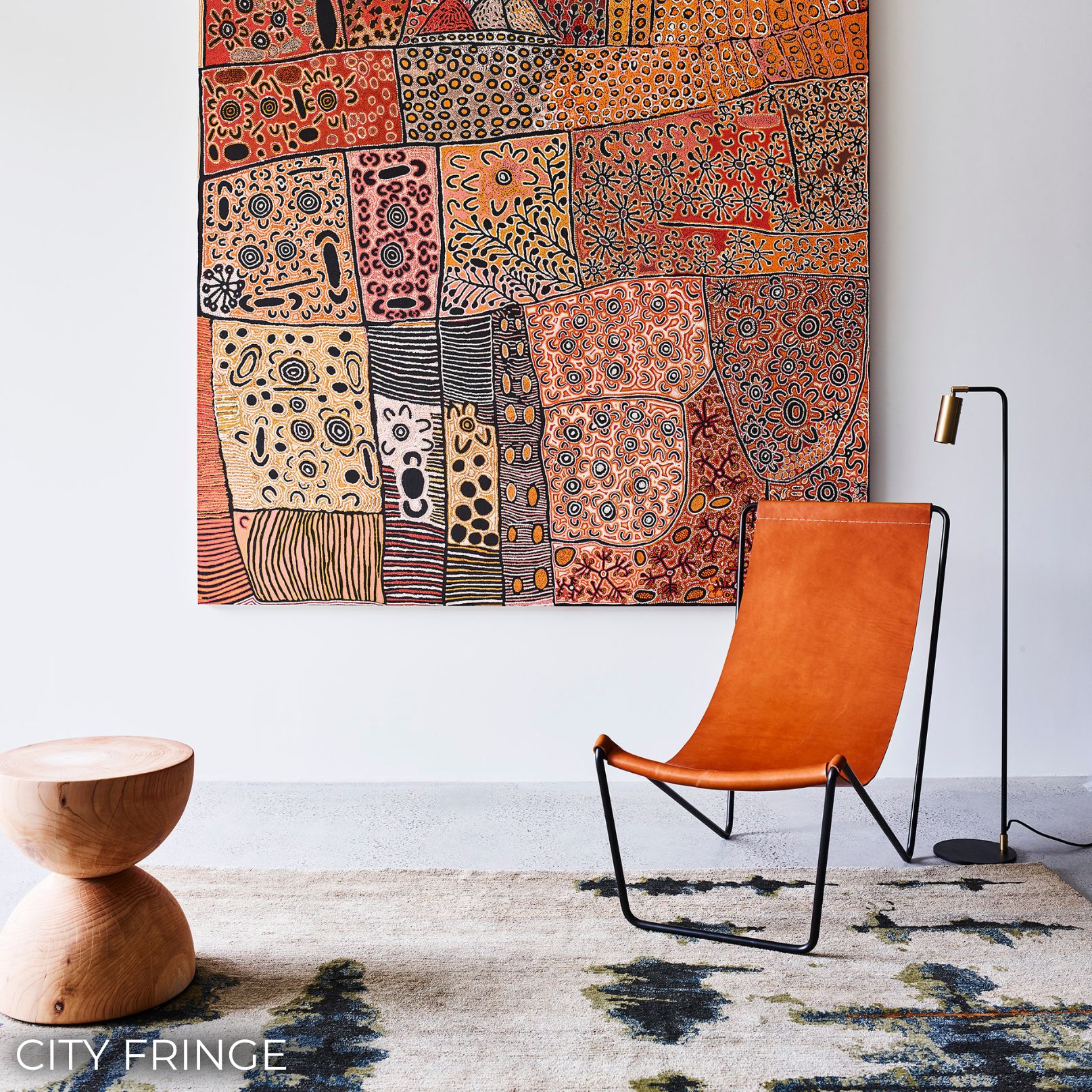
From there, colour is built in layers and textures. The first comes during design, where the stone, timber and other finishes are chosen. These set the feel of a room for decades, so they’re considered carefully. Furnishings come next and are chosen to sit comfortably with what’s already there, not trying to compete with it. The last layer is the most personal. Linens, cushions, accessories and artwork pull the palette together, often bringing out a colour that has been waiting quietly in a painting or a rug.
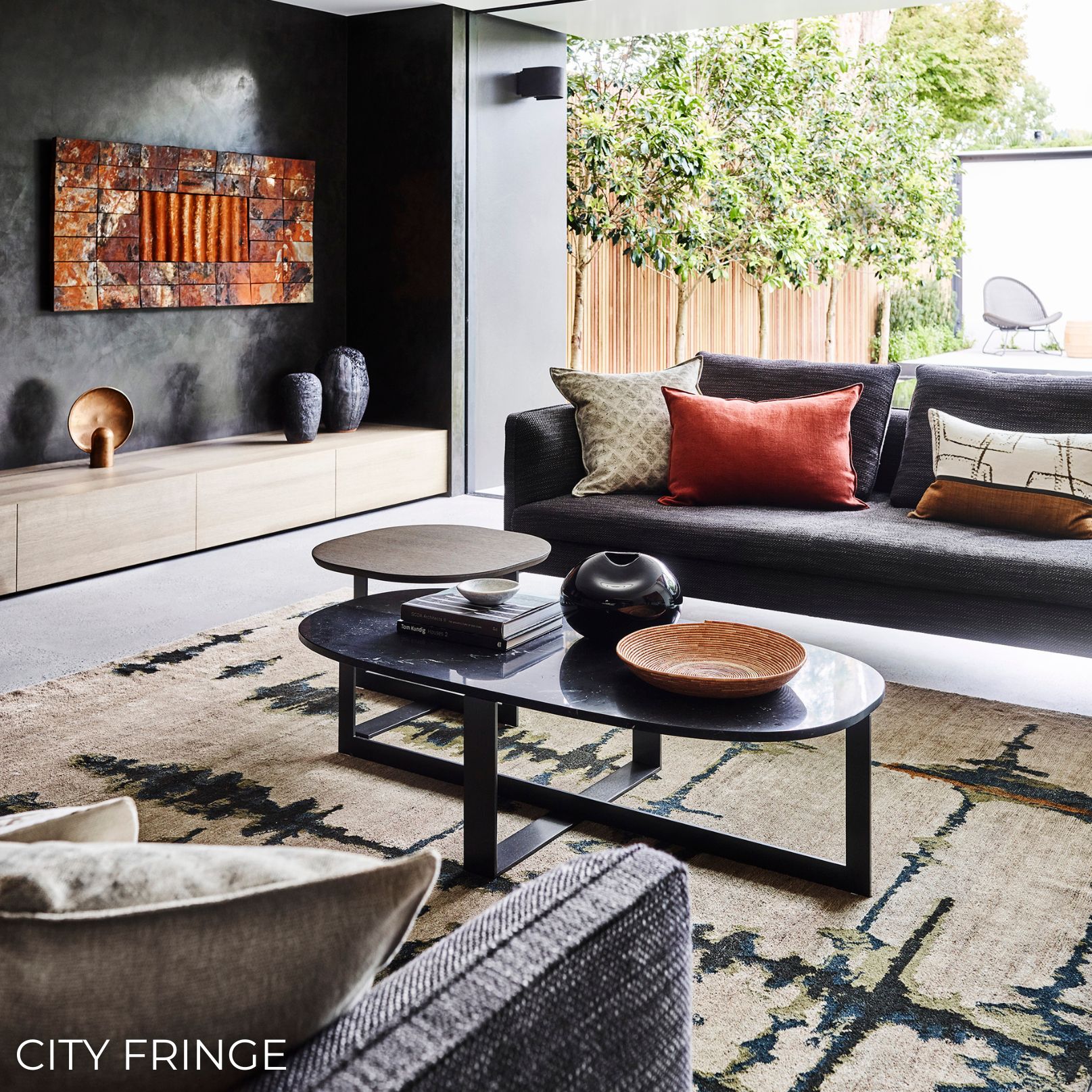
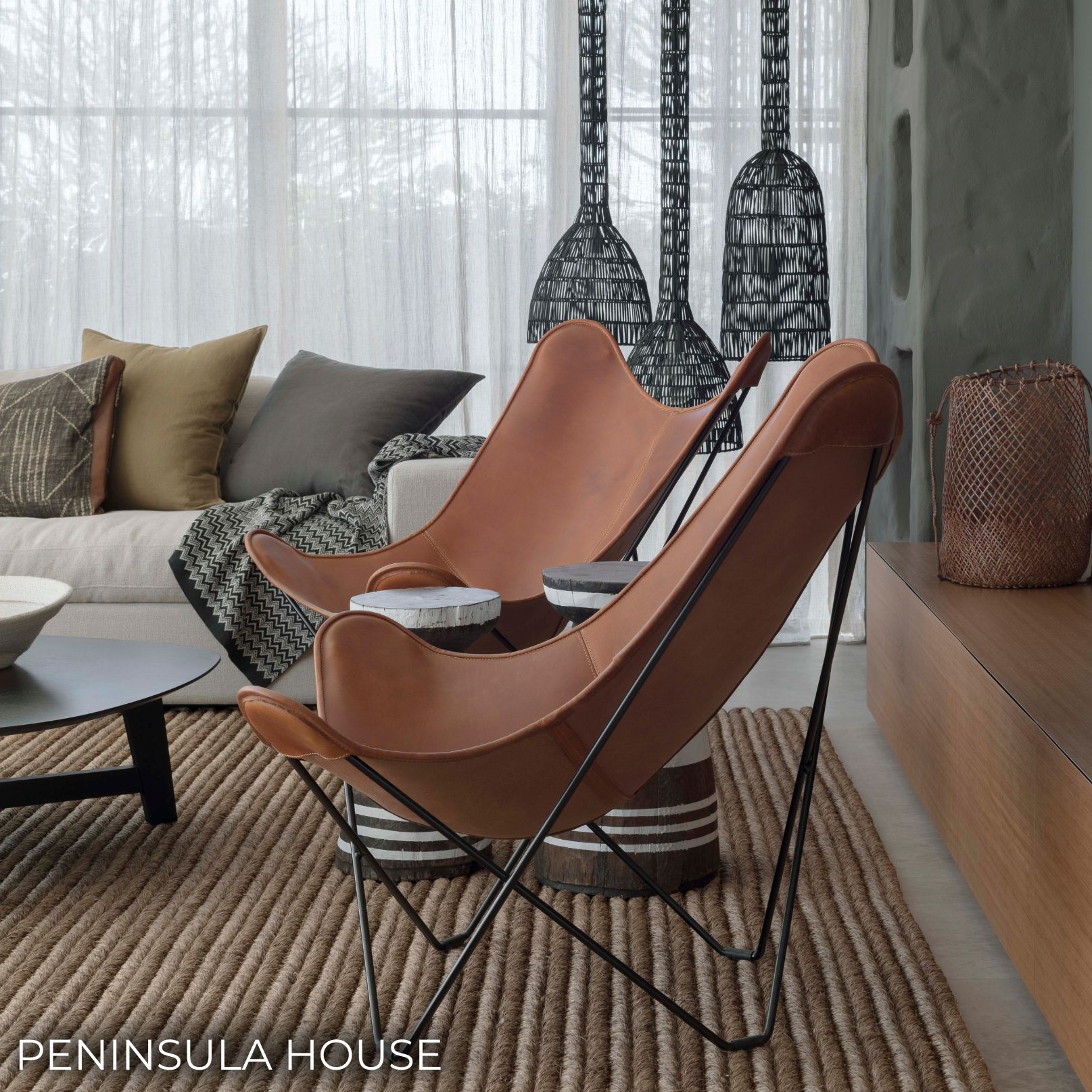
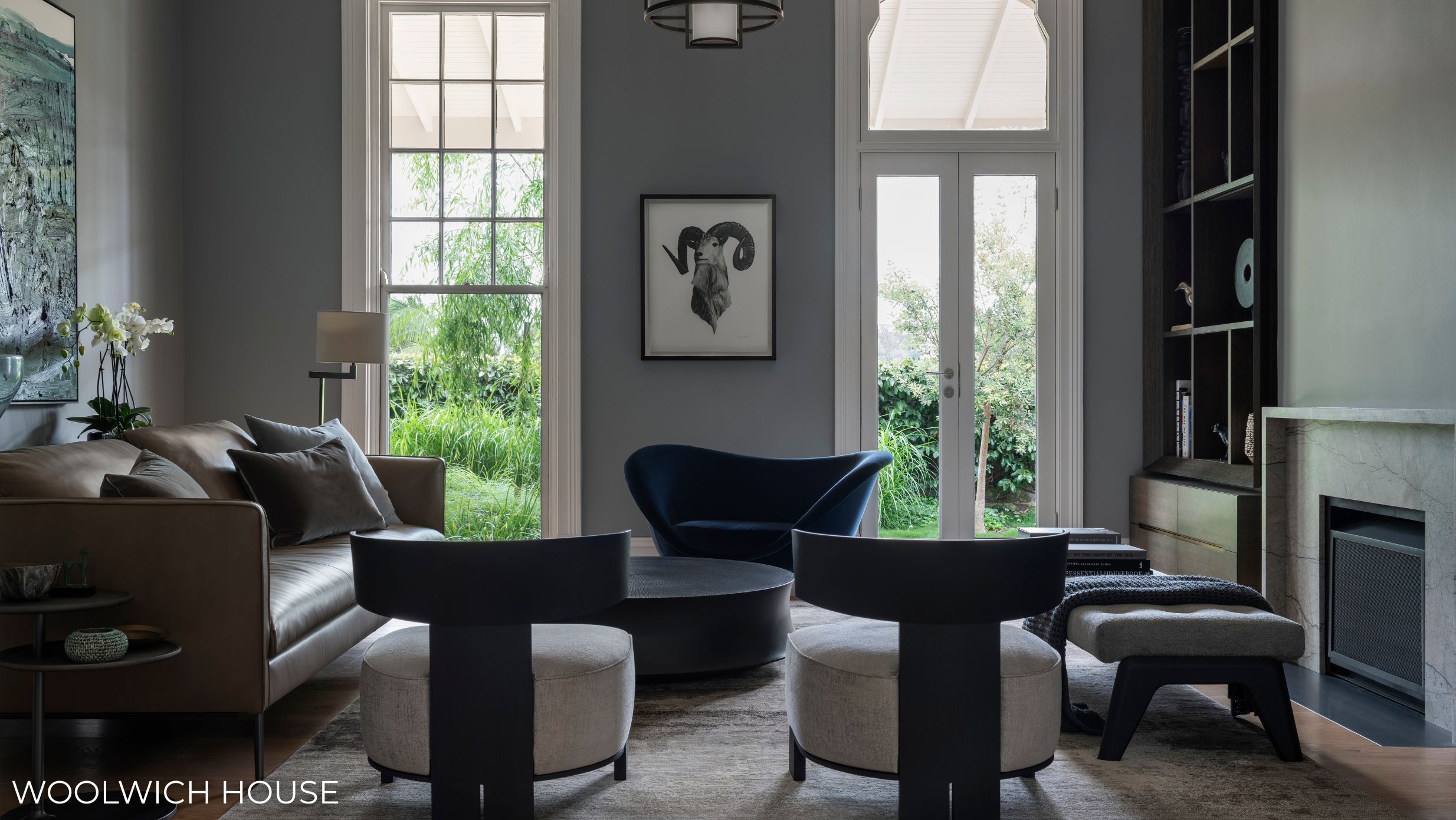
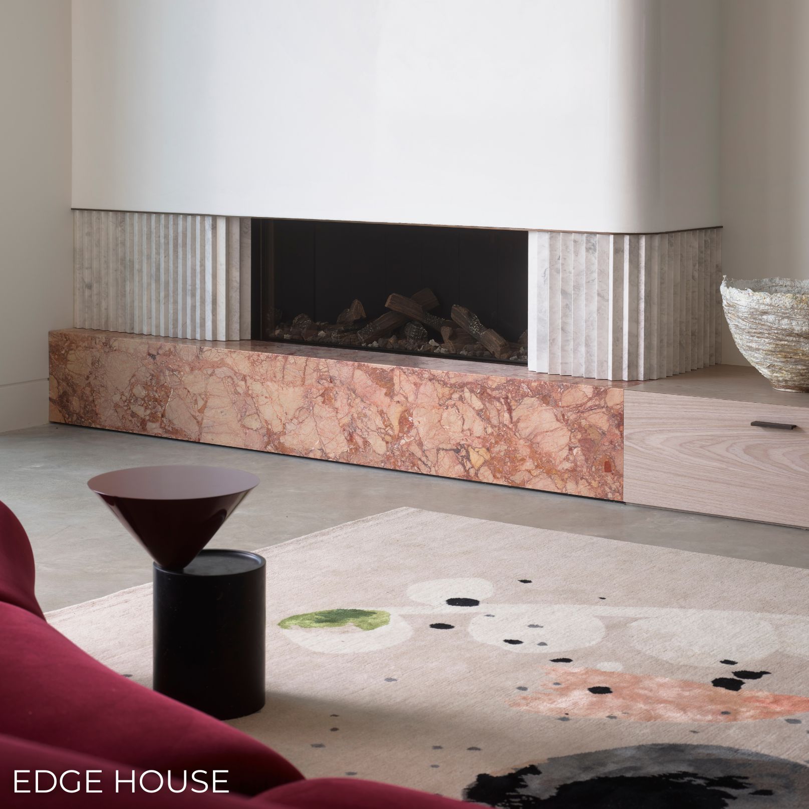
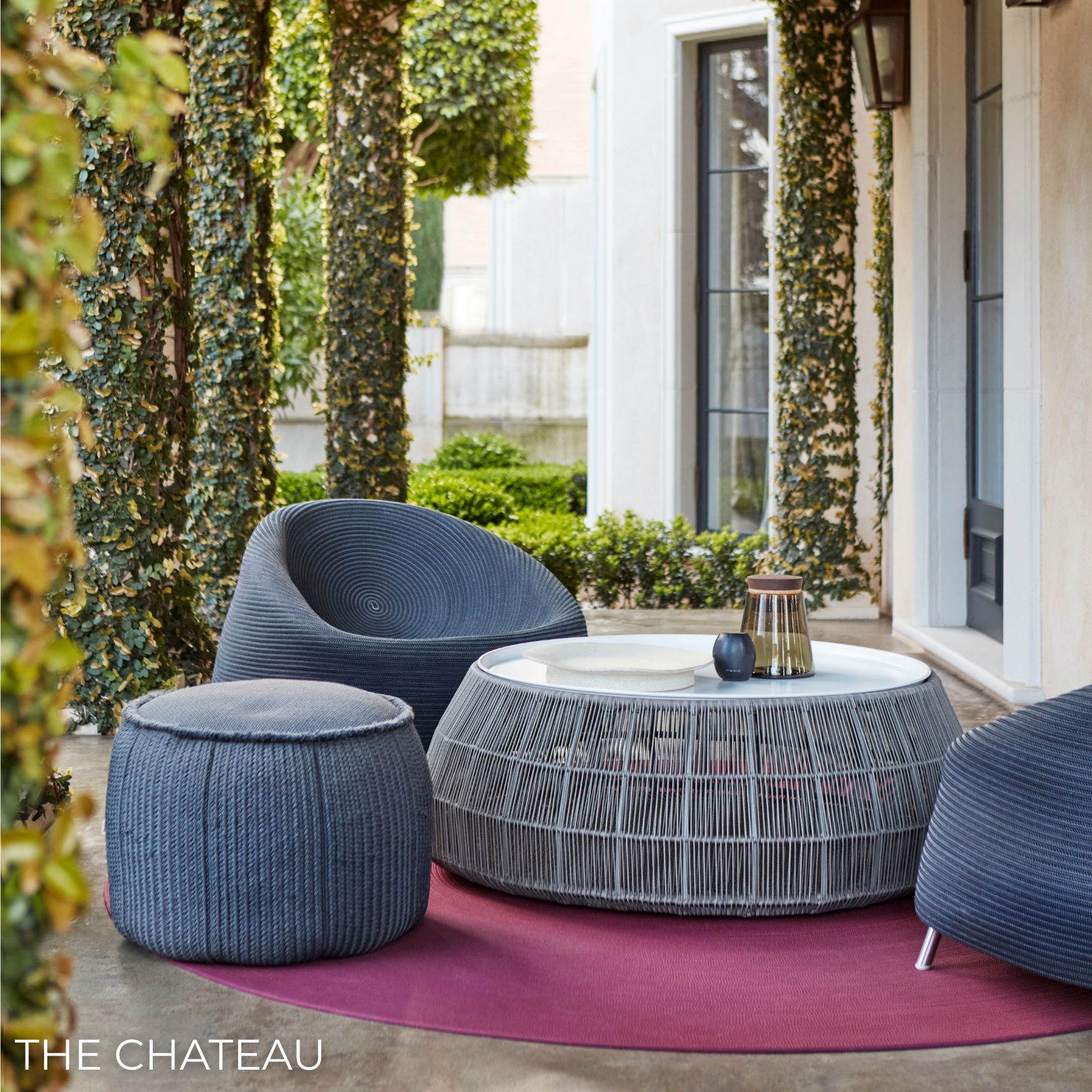
Layering also allows colour to arrive gently. For clients who feel hesitant about colour, it rarely starts on the walls. It might enter through a velvet chair, a throw at the end of the bed or a favourite artwork, one layer at a time, until the room holds more colour than they expected and still feels completely their own.
That feeling, more than any single colour, is what we’re working towards from the very first conversation. Nothing in the room was chosen to suit a particular moment. It came from where the house sits, from the people who live in it and from many considered decisions made over time. That’s why it doesn’t date. It simply feels like home and it will go on feeling that way long after the last artwork has been placed.